Design Thoughts

Upgrading My Design Space

My tools for designing kinetic sculptures continue to evolve. For years I have been designing on a a 50 pound MacPro behemoth with a 30" display. I needed the horse power to render my animations quickly and to make videos. I thought I needed a big screen. With the evolution of more powerful laptops with beautiful displays like the Retina Macbook Pro I have changed my tool of choice.  I moved out of my office, sold my desktop setup and bought a laptop. I can now do my designing wherever I can take my laptop. My favorite locatio is sitting up in the gallery space at my studio, often sitting on the sofa enjoying a cup of tea or coffee with Silver Symphony ringing gently in the background. This is a wonderful solution except when I need to be working on two computers at once.

I have a physics program (Working Model) I use for center of mass calculations. It only runs on "ancient" Mac system 9, that in turn, only works on old Macs. . When I need to figure out a center of mass, I work between this program on a 10 year old iBook and Illustrator on new Macbook Pro. I can't balance the two laptops (and my tea) on the sofa. I asked Marji to think about designing a desk for the gallery. I had an old, beat-up press board folding table that just didn't fit in. 

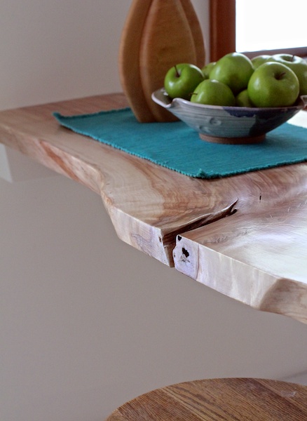
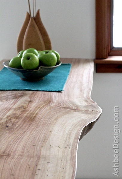
This week, she finished my new desk and it is wonderful!

My "office space" is located in the kitchen area of the gallery space. It is open and visible to the gallery so I requested that the desk be artsy yet functional. Marji thought using a live-edge slab of wood would create a perfect desk. I can sit up high, gaze out the windows and dream.  It's a great place to work.

Marji has posted a couple of blog posts over on her blog, AshbeeDesign.com about this desk and how we made it. Take a look at these two posts: 

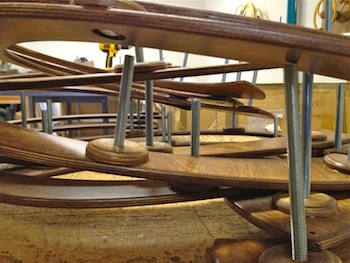
Here are a few detail shots.
 

 It's perfect!

Choosing Music for the Motion • musopen.org

This past month David completed a collection of White Water sculptures and their variations. The unique thing about White Water is that David designed it to be a sculpture alone. But if you have a taller wall, White Water has been designed to be combined in tandem vertically to create Falling Water II. And if you have a larger horizontal space, put it together differently and two White Waters makes an Avalanche.

David had orders for all three, and completed them togther. We noticed that the videos on the website and in YouTube for these three sculptures were created using older technologies and we have learned to make better videos since then. With all three sculptures complete and in the shop at the same time, it made sense to set them up and shoot new video. This past week David completed the editing on the three new videos. And that is the long way to get around to the subject of this blog post!

Over the many years David has been creating videos he has also experimented with background music. Options are limited because of copyright restrictions. He has experimented with changing options some with more success than others, but he has recently discovered and started using the music from musopen.org. This online resource is a non-profit organization with the goal of "Setting Music Free." They are "focused on improving access and exposure to music by creating free resources and educational materials. [They] provide recordings, sheet music, and textbooks to the public for free, without copyright restrictions". They provide open source music recorded and shared as open source performances. All three of these new videos have compositors from the Bach Goldberg Variations from the collection at musopen.org as accompaniment. David spends hours researching the music for each video. Check these out and compare and contrast how they impact they viewing experience.

Avalanche

White Water

Falling Water II

 Do you have a favorite sculpture? How about sculpture/music combination? Do you like the music with the video? We'd love to hear your opinion.

Kinetic Sculpture Computer Files

David works extensively in Adobe Illustrator. He has developed libraries of kinetic sculpture parts and documents filled with layers. He turns the layers on and off depending on which sculpture he is working on. Recently all layers were turned on at once and the resulting image is a work of art unto itself.

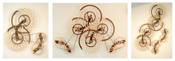
This is a screen shot of the layers on. Wood That Works, all sculptures, one image!

Labyrinth • Kinetic Sculpture Being Built


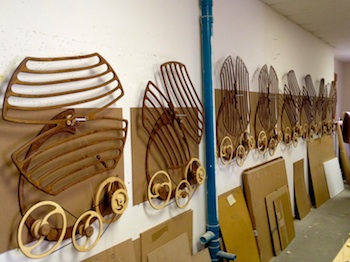
Labyrinth was my most recent kinetic sculpture introduction and it was well received. That translates into a lot of work in the studio constructing the sculptures that were ordered. A working shop is visually an interesting place and I have started photographing some of the views I see on a regular basis. (Yes, I love the new and improved camera in the latest iPhone.) I have been creating a visual journal and decided to share some of the photos here.  

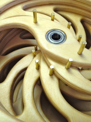
Bearings by the bucketful....

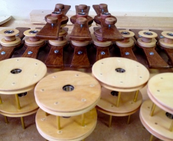
Parts set for assembly into more complex parts.

Carrying brackets lined up for finishing.

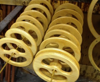
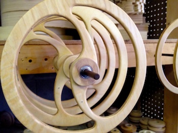
Wheels drying after being finished.


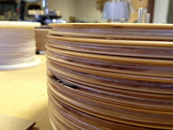
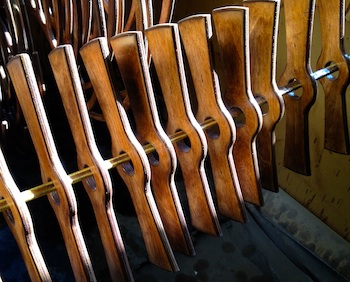
Parts creating visual patterns.


More complex parts coming together and being stacked.


Multiple wheel assemblies being tested.


Building the winding mechanism.


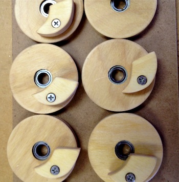
Lots of tiny pieces get added along the way.


Power source (constant force spring) is added.


Base units getting assembled.


Interesting angle of parts waiting for assembly.


A line of bases on the wall with drive wheels added.


The first level of the patterning wheel is added.

That is a far in the process as my photography takes us. I am enjoying recording the process photographically. Often the compositions of the photographics are artistic unto themselves. But as you can see, there is still much work to be done before I can ship. Back to the studio!

Inventor Released • A Simple Kinetic Sculpture


Inventor Released is the second wall-mounted kinetic sculpture designed by David.  He created it immediately following B.W. Cornwallis in the spring of 1976 (Link to post about B.W.) He recognized the inefficiencies in B. W. and was trying to improve upon them.


This sculpture, like its predecessor, is an escapement mechanism. Escapements have been used for centuries in clock making and can be used to measure regulated increments of time. David has always modified escapements, not worrying about their time keeping characteristics but instead working to maximize motion.  It has allowed for a creative freedom that has always impacted his work. Compare the very visual motion in Inventor Release to the amount of motion you see in a clock.


In Inventor Released, David added an arm connected to the rotating wheel with a string. This allowed for some degree of adjustment by varying the string length. This is a great sculpture to study because it is one of the simplest and most revealing of David's designs. Basically, the weight is attached but can't descend because it is being held in place by the wooden ratchet. The pendulum wheel spins in one direction shortening the string and lifting the arm which causes the ratchet to release allowing the weight to drop just one notch before re- engaging. 


The power from the release is transferred back through the arm giving it a needed push.

It now has enough energy to cause the main wheel to wind in the opposite direction, again shortening the string and again releasing the ratchet to repeat the process.  

David's early pieces were all powered by descending weights. This is also similar to many early clocks. Inventor Released had the one descending weight and the higher you mounted the piece, the longer it would run. The limited factor was always that you needed to be able to reach the sculpture to wind it up again!

In the early years the inevitable question was, "Is it perpetual motion?" Clearly not. It requires the viewer to keep winding it up.

As you listen to the video you will hear the very loud and rhythmic click.  David knew that a loud noise is the result of an inefficient mechanism. (It was also truly annoying to live with!). It was an effort to try and reduce the noise that kept David designing. A trend in David's work has always been that new designs evolved as he tried to solve things he didn't like about previous ones.  Much inspiration came from his own work.